Synclat has a new look
A new logo, a floating glass sidebar, a warmer light theme and new sign-in screens. Here is everything that changed in how Synclat looks and feels.
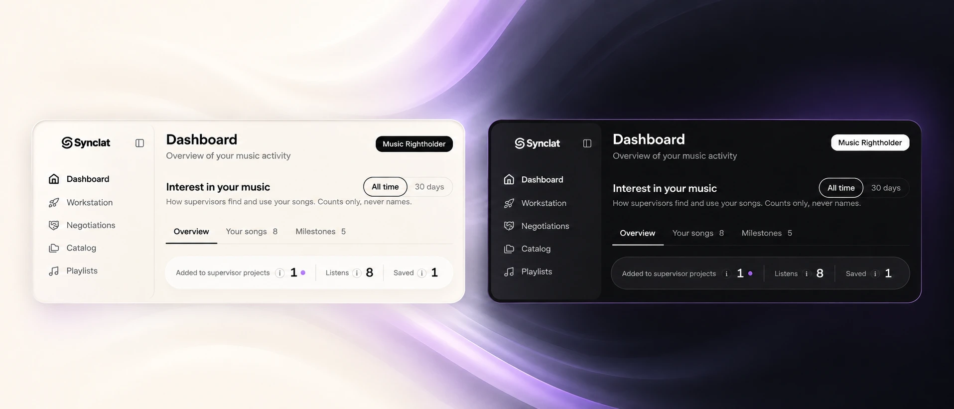
Synclat has a new look. This month we changed how the whole platform feels, from the logo to the sign-in screen. Here is what is new.
A new logo
A cleaner mark that stays sharp at any size, from a tiny tab icon to a big screen. You can already see it on the site, in the app and on the app icons. A few emails still need the swap and will get it over the next days.
A floating glass sidebar
The sidebar now floats over the page like frosted glass, with a soft lilac glow from the left and bolder icons. A New SABIA chat button sits on top, and your photo and name are at the bottom.
A new way to sign in
The sign-in and confirm screens now use dark glass, with lilac and blue glows that cross behind pill-shaped buttons.
A new search box for SABIA
SABIA's search box is liquid glass too, with a neural sphere behind it on the empty screen.
Same Synclat, same Latin music, a sharper face. Tell us what you think, and if you spot an old logo somewhere, let us know.